Why investors hesitate to trust a stock call
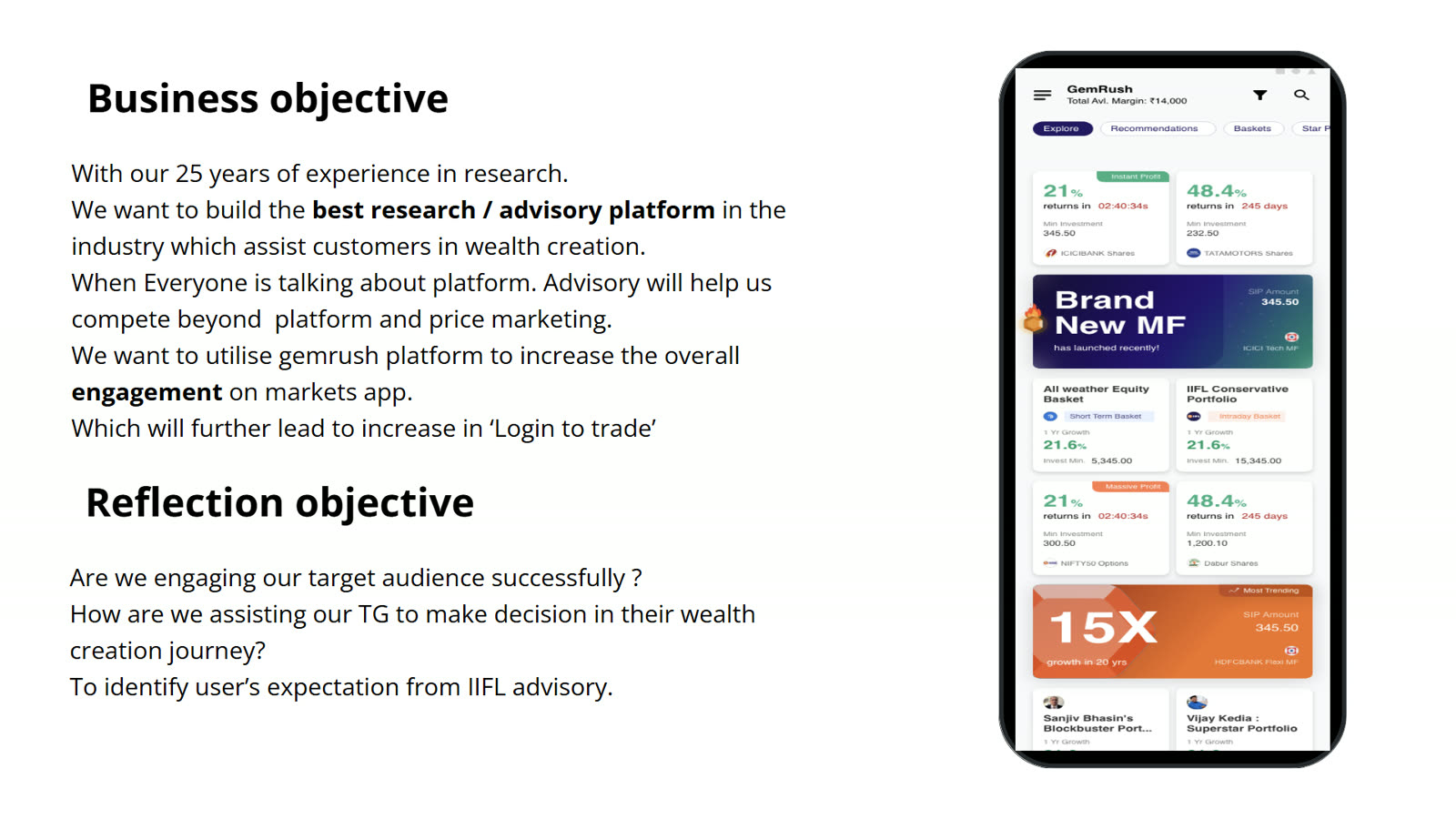
GemRush gave investors stock recommendations. The research asked whether people could find the right call, judge it, and keep track of it after they acted.
First draft. Written from the research files. Shashwita's exact tasks, the study date, the sample (the files mention both 30 users and a smaller usability group) and which changes shipped still need confirming. Slides shown are rendered from the Figma file and still need clearance for public use. Remove this note before publishing.
At a glance
- Organisation
- IIFL, financial services
- Product
- GemRush, a stock-advisory experience
- Research type
- Mixed-methods evaluation and usability study
- My role
- UX researcher on GemRush
- Methods
- Heuristic review, survey and interviews, funnel analysis, competitive study, usability testing
- Status
- Research complete; changes proposed
The question
A stock recommendation is only useful if the person reading it believes it, understands it and can act on it. The team wanted to know where that chain was breaking for GemRush users.
- Can investors find the recommendations that are live right now?
- What makes them trust a call enough to act on it?
- What happens after they buy: can they follow the call through?
How the research ran
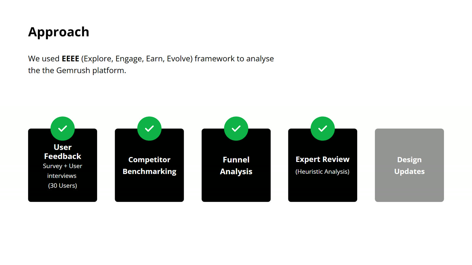
No single method could answer all three questions, so the study layered them.
- Heuristic review and a competitive study to find obvious problems and see how other advisory products handle trust and tracking.
- Funnel analysis to see where people stopped.
- Survey and interviews to hear what investors expect from advice and how they decide.
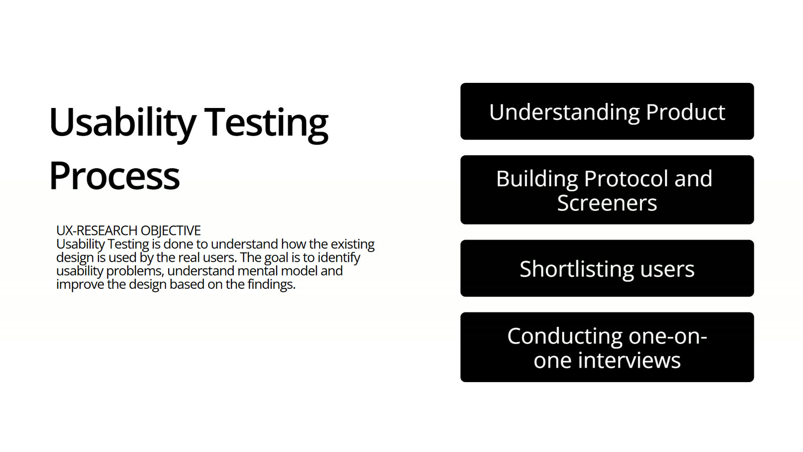
- Usability testing with a small group, to watch people use the product rather than describe it.
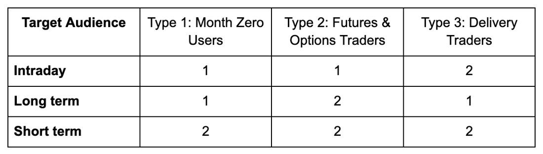
What the 1s and 2s in the matrix mean (for example participants per cell) is not stated in the files. Confirm before publishing, or remove the figure.
What we saw
Which call is current?
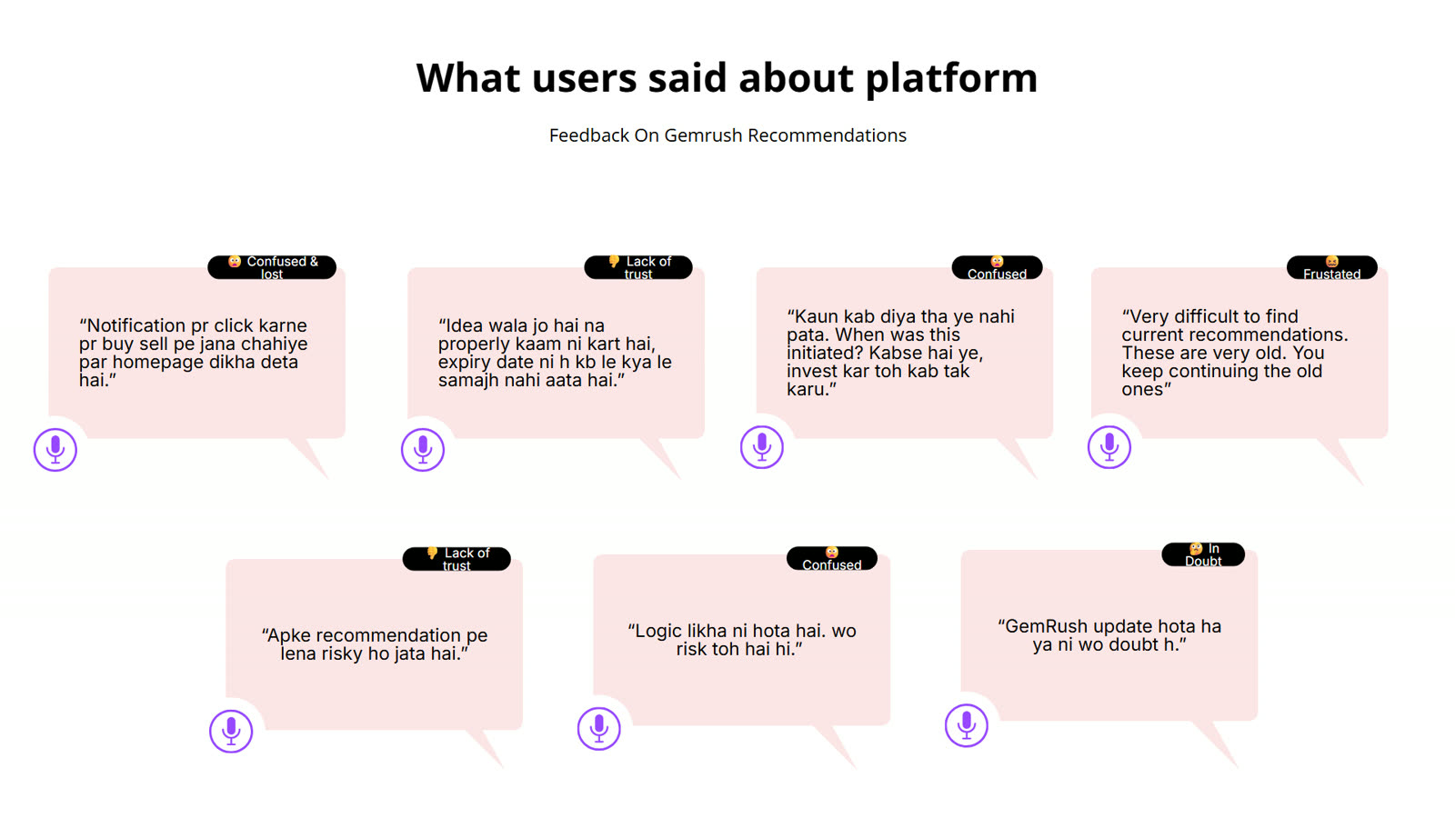
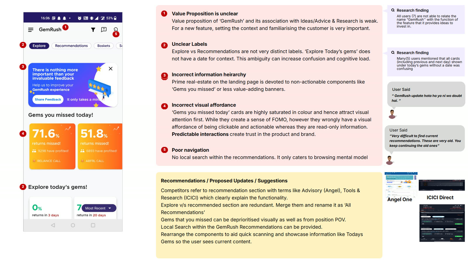
People found it hard to tell which recommendations were live. Dates and status were easy to miss.
Why should I trust it?
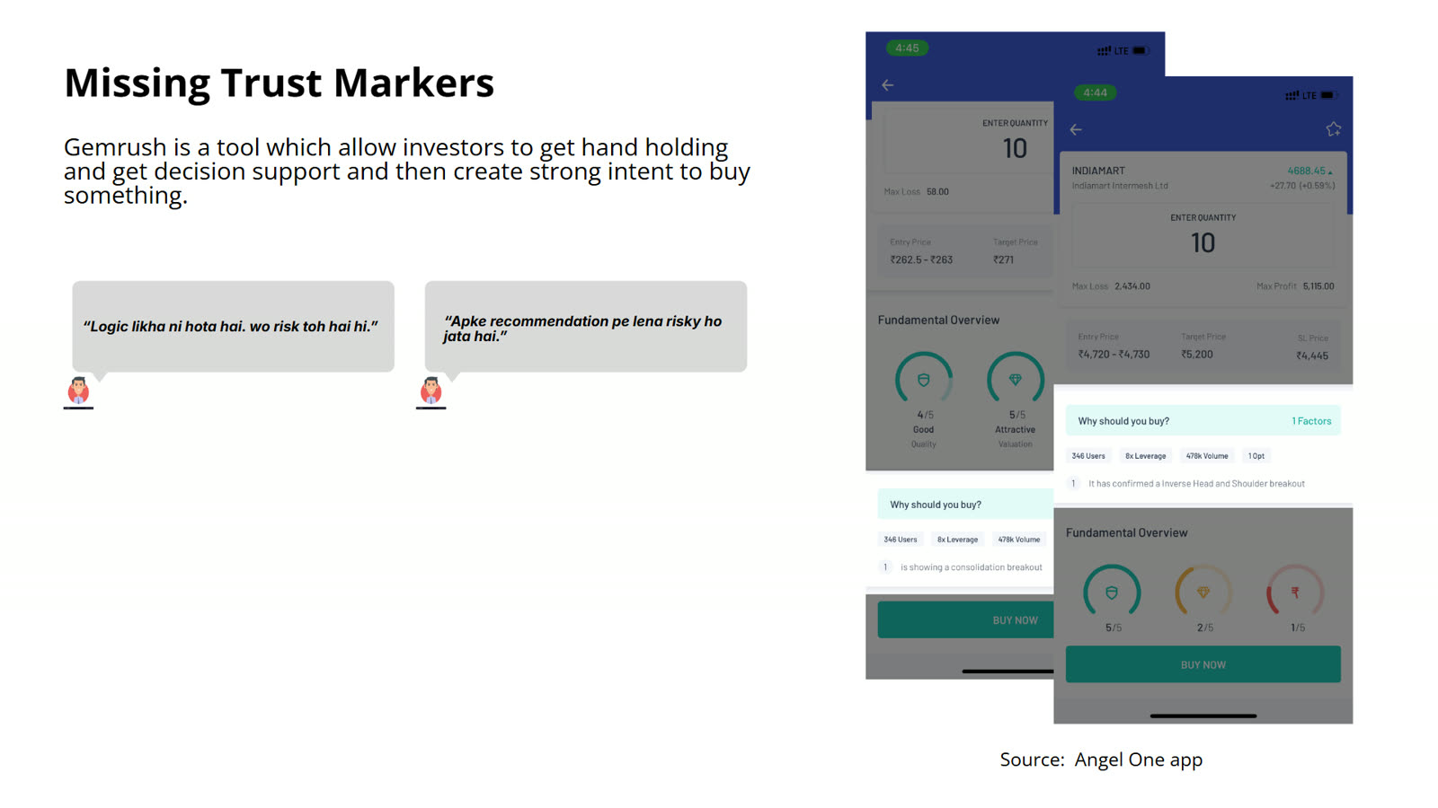
Participants looked for the reasoning behind a call before acting. Rationale and trust markers were thin.
What can I tap?
Cards were misread. People were not sure what was interactive or where it would take them.
Where did my alert go?
Notifications did not always land on the screen people expected.
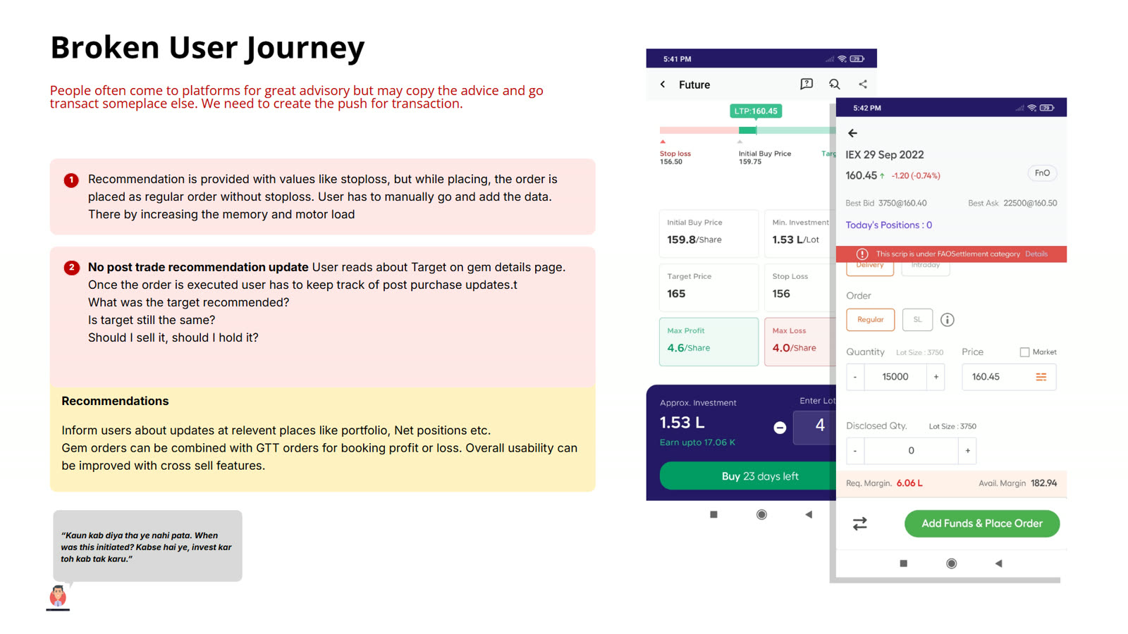
After buying, investors also struggled to follow how a recommendation was doing. The product helped people into a trade, then left them to track it themselves.
Where it pointed
Tactical fixes
- Show the date and status of every call clearly.
- Make cards behave and look the way people expect.
- Let investors track a recommendation after purchase.
- Send updates to where people look for them.
Strategic opportunities
- Personalised recommendations.
- Advisory for mutual funds.
- Ways to validate an idea before acting on it.
- Clearer ongoing communication with investors.
These are recommendations and design explorations. The research files do not show which were shipped.
What this can't say
- The usability findings come from a small group. Counts describe those participants, not how common a problem is among all investors.
- No uplift in engagement or conversion is claimed. Returns shown in product mock-ups are product content, not research results.
- Recommendations are proposals. Adoption is not claimed.