Finishing the form was not the hard part
A redesigned personal-loan journey tested well on completion. The research looked at what completion hid: unclear words, missing human support, and a speed people did not quite believe.
First draft. Written from the research files. The study month (files say both April and May 2023), participant count and mix, Shashwita's specific tasks and which changes were made still need confirming. Remove this note before publishing.
At a glance
- Organisation
- IIFL Loans
- Product
- A redesigned personal-loan application, tested as a clickable prototype
- When
- 2023
- My role
- UX researcher, IIFL
- Methods
- One-to-one in-person sessions with a moderator and a note taker, prototype tasks, audio and video recording
- Status
- Research complete; changes proposed
The question
Before building a new personal-loan application, the team wanted to know whether the redesign matched how people think about a loan.
- What do people expect from each step of applying?
- Can they find what they need without help?
- Does the language make sense to them?
How the research ran
Sessions were one-to-one and in person, lasting 30 to 45 minutes. Participants worked through a clickable wireframe prototype of the journey while a moderator guided them and a second researcher took notes. Sessions were recorded.
The prototype covered the whole path: signing up, checking eligibility, collecting documents, understanding the EMI and planning repayment.
Alongside: reviewing the existing journey
The wider loans work also included a review of IIFL's existing loan products, using guerrilla testing, secondary research, benchmarking, app-store reviews, a heuristic analysis and support queries.
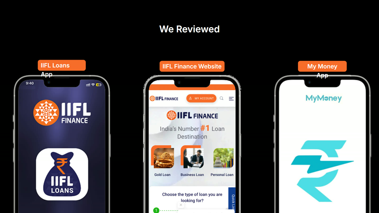
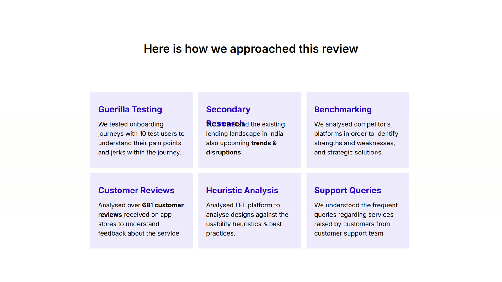
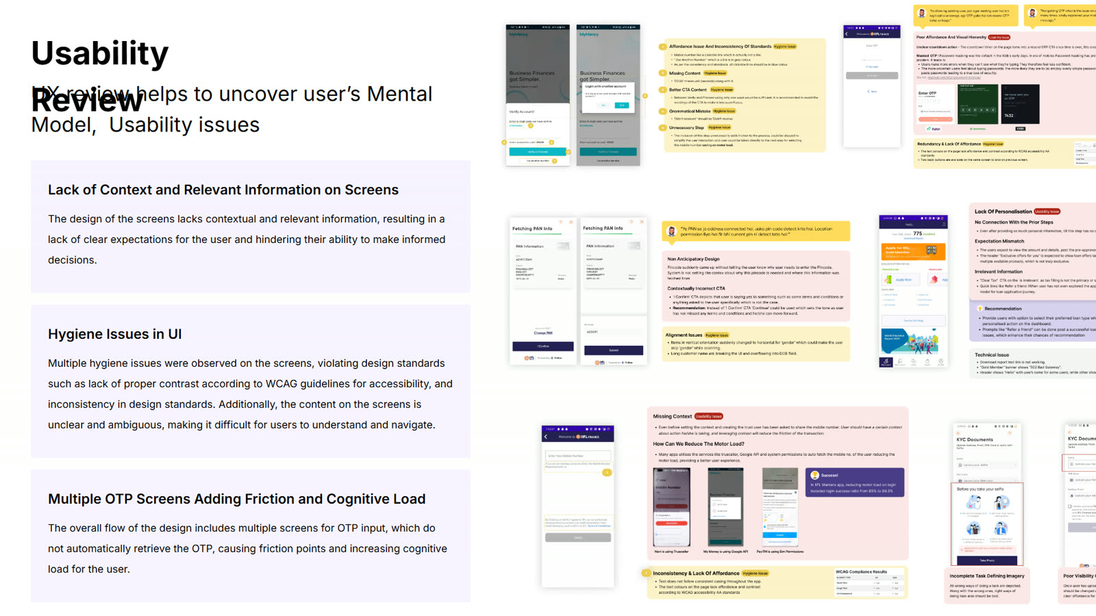
This review deck is a different piece of work from the prototype study above. Confirm it belongs on this page, who ran it, and when, before publishing.
What we saw
The headline was reassuring: participants got through the journey. The detail was more useful.
Words that stopped people
Terms around eligibility and a feature called Auto-Pilot confused participants, even when they completed the step.
A speed too good to believe
Some participants doubted the very fast approval the journey promised. A faster claim did not feel more trustworthy.
A person, on call
Participants preferred being able to reach customer care while applying, instead of working alone.
Task success and comfort were different things. A person can finish a loan form and still not trust the process they just went through.
Where it pointed
- Plainer language for eligibility and for features such as Auto-Pilot.
- More transparency about what is happening and how long it takes, so speed reads as credible.
- Help within reach at the moments people are least sure.
These are proposed improvements. The research files do not show what changed after testing.
What this can't say
- It was a small, qualitative study. "Completed the journey" describes these participants on a prototype, not a success rate in production.
- No task timings, conversion or approval figures are claimed.
- Recommendations are proposals. Adoption is not claimed.